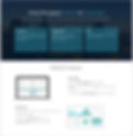
Onehop is one unique platform created for business-to-business SMSs. Onehop helps customers to search, compare, and analyze from among the top SMS aggregators and make the right choice depending on their business' SMS requirements.

The Goal
1
Understand the current process and exact needs of the user
2
Translating abstract concepts into solution
3
Keeping the design simple and clutter free
Initial Research

Document analysis
I read documents to understand the details of SMS Marketing and Bulk SMS

Contextual Enquiry
I conducted interview to understand users' processes to buy and manage bulk SMS packs
Key challenges for the users

My role
-
Full cycle UX designer
-
Used design thinking methodology
-
Collaborated with the Product Owners and the Development Team

My process
-
Iterative Collaborative Fluid
Key challenges for the users
Complex research process
Hard to select the right option
Time consuming
process
Hard to manage the purchased packs
User Flow

Area of focus

Brainstorming - sketching and idea genration
After there was data collected in the previous step we decided to have a sprint to generate ideas to create design solutions for the data collected.


Wireframe
After there was data collected in the previous step we decided to have a sprint to generate ideas to create design solutions for the data collected.


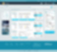
Medium Fidelity Prototype
I used the Adobe suite for producing the interfaces of all the main sections of the website. The goal of doing this was to evaluate a more faithful version of the new solution, which would include rich interactions so evaluators can get a better understanding of my vision for the future platform.


Usability Testing
We used the contextual inquiry method to understand if the displayed information displays the information the users are looking for.
-
We did the user testing in our offices by observing users using the app.
-
We requested them to speak out loud while they use the system.
-
We recorded the observations by .noting them on notepads.
-
Post activity interview: We asked the users about their experience after they completed the activity.
-
We conducted a similar test with our offshore users.
I created the basic designs in photoshop and exported them to Marvell app to create an interactive mockup
Final Design


Design Handoff
I collaborated with the developers to discuss the design handoff process. I discussed about the interaction designs. At that point in time, we did not have access to tools like zeplin. Therefore we design documents and a checklist with the developer to have clear communication about the design specification. The document contains the following details.
-
Typography: Specified the font name, font size, weight, emphasis, line-height.
-
Iconography: Icons that were handed over to the development team with a specific file type, size, and format.
-
Color Palette: The color palette included the colors that were in sync with the other products of Screen Magic.